
Archive of the Gamebuino Classic forum (2014-2018), rebuilt from the pages kept by the Wayback Machine: only part of the topics and pages were captured. Read-only. Removal on request: hi@gamebuino.com.
mockups for new gamebuino
adekto Fri Apr 21, 2017 6:28 pm
hey everyone, you heard about that new gamebuino?
80x64px and 16 color, awesome! so lets see what that looks like, here are just a few mockups
just a disclaimer these are not games in development (but they can be in the future)
a match 3 puzzle game
a visual novel
a side scroller with ninja's, helicopters, plasma rifles, explosions and terrible one liners, uhh what was i talking about again?
i hope you like this and i would love to see any other mockups you make
80x64px and 16 color, awesome! so lets see what that looks like, here are just a few mockups
just a disclaimer these are not games in development (but they can be in the future)
a match 3 puzzle game

- gem-gem.png (19.7 KiB) Viewed 7446 times
a visual novel
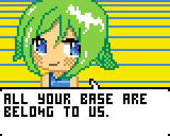
- visualnovel.png (18.05 KiB) Viewed 7446 times
a side scroller with ninja's, helicopters, plasma rifles, explosions and terrible one liners, uhh what was i talking about again?
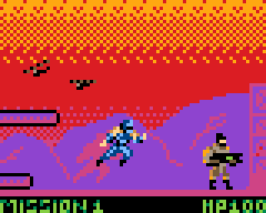
- operation-ninja.png (16.62 KiB) Viewed 7446 times
i hope you like this and i would love to see any other mockups you make
Attachments: pallet.png

babadu83510 Fri Apr 21, 2017 11:22 pm
Are you sure it is not 80*48 ?
Edit : it must be my imagination
Edit : it must be my imagination
wuuff Sat Apr 22, 2017 6:30 am
I could have sworn it said 80x48 at some point, because I remember thinking, "That's smaller than the Gamebuino screen. Why would he make it even smaller?" And I have searches in my browser history for "80x48 resolution" too (I was searching for devices/screens with that resolution). Perhaps both you and I misread it?
More on topic, those mockups look pretty nice. I would be interested in doing a visual novel collaboration on the forums sometime in the future if people are interested. I love your visual novel mockup.
More on topic, those mockups look pretty nice. I would be interested in doing a visual novel collaboration on the forums sometime in the future if people are interested. I love your visual novel mockup.
adekto Sat Apr 22, 2017 10:45 am
lol yea its still 4 pixels smaller on the width then the original gamebuino, but overal resolution is higher + color helps allot.
if you have any ideas for a visual novel i be up for that too, you can take the art from my mockups if you like ;)
if you have any ideas for a visual novel i be up for that too, you can take the art from my mockups if you like ;)
rodot Mon Apr 24, 2017 10:26 am
Wooow, that looks awesome ! Glad to see you back among us Adekto.
The 80*48 was a typo in the original blog post I corrected right after. The right resolution is 80*64. A tad narrower than Gamebuino 1, but taller, and as adekto said, with color you can show much more with the same resolution.
I'm curious to see what everybody comes up with :)
The 80*48 was a typo in the original blog post I corrected right after. The right resolution is 80*64. A tad narrower than Gamebuino 1, but taller, and as adekto said, with color you can show much more with the same resolution.
I'm curious to see what everybody comes up with :)
Drakker Mon Apr 24, 2017 10:44 am
The 16 extra vertical pixels are a godsend. I was always short of a few vertical pixel, but had plenty of horizontal pixels with the GB1.
jonnection Mon Apr 24, 2017 2:24 pm
I was very puzzled with the 80x48 as there is no color display that fits the bill. It's an odd resolution.
With 80x64 my bet is on 1.8" ST7735R
With 80x64 my bet is on 1.8" ST7735R
mougino Mon Apr 24, 2017 6:47 pm
So Gamebuino v2 is not Pokitto ?? :-o
I was under the impression it was...
What a suspense!!
I was under the impression it was...
What a suspense!!
adekto Mon Apr 24, 2017 8:09 pm
they do use the same screen i think.
got some more mockups
tried a fighting game but not looking super good
isometric puzzle game, not sure what you do but i liked the style
title screen, with that classic 80s sunrise
got some more mockups
tried a fighting game but not looking super good
- mk-clone.png (16.31 KiB) Viewed 7348 times
isometric puzzle game, not sure what you do but i liked the style
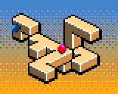
- isometric.png (17.59 KiB) Viewed 7348 times
title screen, with that classic 80s sunrise
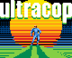
- ultracop.png (16.42 KiB) Viewed 7348 times
jonnection Tue Apr 25, 2017 5:09 am
adekto wrote:they do use the same screen i think.
Nope. Pokitto has a 220x176 2.0" screen. I investigated the 1.8" 160x128 but dropped it because I wanted to run Arduboy games as well.
mougino wrote:So Gamebuino v2 is not Pokitto ?? :-o
I was under the impression it was...
What a suspense!!
Yes! Isn't it great!! :lol:
Zvoc47 Wed Apr 26, 2017 9:11 pm
Wow! This reminds me of the good old days of gaming on old phones like Siemens C60 and Nokia 6610. Stack Attack, Snake, Bounce, etc..
Now, I'd like to ask. Where would the frame buffer be located? In the SRAM of the GB2's microcontroller or only in the screen?
Now, I'd like to ask. Where would the frame buffer be located? In the SRAM of the GB2's microcontroller or only in the screen?
Drakker Wed Apr 26, 2017 9:43 pm
Adekto & Erico: fantastic!
erico Fri Apr 28, 2017 2:53 pm
Thanks, that joust mock is quite great.
I was thinking about doing one too, but I think I will go for a "Pegasus and the Phantom Riders" type of Joust as it may fit the single screen better.
I was thinking about doing one too, but I think I will go for a "Pegasus and the Phantom Riders" type of Joust as it may fit the single screen better.
Drakker Thu May 04, 2017 1:46 am
Extremely quick and rough mock up of some vampire game.
Can't wait to see what it looks like on the Gamebuino screen, because on my monitor screen, the darker colors are way too bright and don't look dark enough to be used effectively as background colors.
Can't wait to see what it looks like on the Gamebuino screen, because on my monitor screen, the darker colors are way too bright and don't look dark enough to be used effectively as background colors.
- castle_dude.png (1.63 KiB) Viewed 3277 times
- castle_dude-big.png (2 KiB) Viewed 3277 times
erico Thu May 04, 2017 2:25 am
Looking pretty great! I love pixel skeletons :)
I have uploaded my triple dragon to the pixel joint and had similar criticism...can´t space the players of the backgroung, which is something I originally noticed myself while drawing. I have attempted to split them by hue instead of brightness, but I was unsuccessful as I wanted to keep the closest look to the original arcade. Something could be done, but would require a longer time creating the images. I´d probably have less of this issue if working on an original game.
My monitor is an old samsung syncmaster 2232bw plus, which is very far away from current technology, and I get the same results here. Probably the new Gamebuino has newer technology than this. (I also own a Caanoo to test that out)
edit: according to the palette analises, we only have black, brown and blue as dark tones. The blue, which in itself is a darker tone, sits fine on the darker side. The brown spreads closely to the middle. One reason a 16 colors palette gets a bit washed is that it is trying to convey the whole spectrum and by doing so, other colors can be used to perform a brightness ramp. The fact they are a bit washed can be over run by the colors adjacent to them. In our case, we would have to rely on dithering with the full black, not a good solution to generate extra dark tones on super low res display.
I have uploaded my triple dragon to the pixel joint and had similar criticism...can´t space the players of the backgroung, which is something I originally noticed myself while drawing. I have attempted to split them by hue instead of brightness, but I was unsuccessful as I wanted to keep the closest look to the original arcade. Something could be done, but would require a longer time creating the images. I´d probably have less of this issue if working on an original game.
My monitor is an old samsung syncmaster 2232bw plus, which is very far away from current technology, and I get the same results here. Probably the new Gamebuino has newer technology than this. (I also own a Caanoo to test that out)
edit: according to the palette analises, we only have black, brown and blue as dark tones. The blue, which in itself is a darker tone, sits fine on the darker side. The brown spreads closely to the middle. One reason a 16 colors palette gets a bit washed is that it is trying to convey the whole spectrum and by doing so, other colors can be used to perform a brightness ramp. The fact they are a bit washed can be over run by the colors adjacent to them. In our case, we would have to rely on dithering with the full black, not a good solution to generate extra dark tones on super low res display.
Drakker Thu May 04, 2017 12:24 pm
Unless.... we have a high-res display. We use it at half resolution. For background sprites, we could draw them in a checker-board dithering pattern alternated with black, but in high-resolution. It might require two passes of drawing but it could be doable.
Played some with the colors (using Grafx2, thanks Erico, it works great to play with palettes, way more user friendly than the Gimp for that task)
Some hard choices had to be made and it did complicate the color choice, though if the bright image looks like the darker version on an actual Gamebuino 2, it would be great.
Here's the altered palette I used:
Note that I have absolutely no idea how it will look on the real hardware, so this palette might actually make things worse. Also, for the game mock up shown here, dark colors are desirable... but if you make the next Kirby or Mario game, the brighter palette will be vastly more desirable.
Played some with the colors (using Grafx2, thanks Erico, it works great to play with palettes, way more user friendly than the Gimp for that task)
- castle_dude.png (1.63 KiB) Viewed 3265 times
- castle_dude_darker.png (1.63 KiB) Viewed 3253 times
Some hard choices had to be made and it did complicate the color choice, though if the bright image looks like the darker version on an actual Gamebuino 2, it would be great.
Here's the altered palette I used:
- altered_palette.png (260 Bytes) Viewed 3264 times
Note that I have absolutely no idea how it will look on the real hardware, so this palette might actually make things worse. Also, for the game mock up shown here, dark colors are desirable... but if you make the next Kirby or Mario game, the brighter palette will be vastly more desirable.
- palette_analyze.png (9.59 KiB) Viewed 3264 times
adekto Fri May 05, 2017 8:47 pm
awsome i love castlevania.
i like the "ditter" background idea, on paper its posible since you only need an aditional mask to know wich part of the image buffer is forground and wich is back, even though we we do double pixels on screen (alteast the screen i got) you basicly send data twice, so atleast on in theory its posible to just add ditter to it.
i like the "ditter" background idea, on paper its posible since you only need an aditional mask to know wich part of the image buffer is forground and wich is back, even though we we do double pixels on screen (alteast the screen i got) you basicly send data twice, so atleast on in theory its posible to just add ditter to it.
Drakker Fri May 05, 2017 11:28 pm
True, and the buffer needs to be only 1 bit, ones and zeroes, so its going to be quite small, approximately the same as the buffer we currently use on the Gamebuino 1. With the buffer idea it could actually be done in one pass with some creative coding. If on even rows the pixel is in the buffer, set even pixels on the two pixels row to black, and on odd row set the odd pixels to black, so you get any pixel that's in the background buffer to be dithered at maximum resolution and the other pixels are drawn as normal at low resolution.
That also indirectly increases the color count to 32 instead of 16.
Push it a bit farther and you get all 256 possible mixed colors if you use two 4 bits buffers. If you alternate the dithering on each pass, it might even switch fast enough that flickering will be barely noticeable like gray on the Gamebuino 1. But then again, you might as well use a single 8 bits buffer in 256 colors...
That also indirectly increases the color count to 32 instead of 16.
Push it a bit farther and you get all 256 possible mixed colors if you use two 4 bits buffers. If you alternate the dithering on each pass, it might even switch fast enough that flickering will be barely noticeable like gray on the Gamebuino 1. But then again, you might as well use a single 8 bits buffer in 256 colors...
Drakker Sat May 06, 2017 5:24 pm
- pinkpuff.png (1.52 KiB) Viewed 3231 times
- pinkpuff_big.png (1.71 KiB) Viewed 3231 times
As expected, the palette works great for games that are a bit more cartoony and bright.
erico Sat May 06, 2017 8:37 pm
That pinkpuff mock is sweet, kind of thing that makes one want to bite it. Exactly the kind of mock up I prefer.
I understand the dither high res code, it could be a way to extend stuff, but I like to see dithering because it doesn´t only "produces" more colors but because it adds texture to the image (it does not need to be a checkered one).
I´d say the palette works fine if you are working with single color elements on the foreground and they have border.
If one tries to do a non border sprite, trouble arises, you would have to keep certain colors for background only, otherwise the sprite may disappear at some places (which may not be a bad thing, could be used on purpose on some games). Now if you add shading to the sprite, things get even trickier.
I have tried to push a Pegasus/joust mock, but depicting a flying horse with its rider yielding a weapon on the new gamebuino´s resolution is quite a feat...will have to use more time to find out a proper solution. What I have made so far is total crap. :(
I understand the dither high res code, it could be a way to extend stuff, but I like to see dithering because it doesn´t only "produces" more colors but because it adds texture to the image (it does not need to be a checkered one).
I´d say the palette works fine if you are working with single color elements on the foreground and they have border.
If one tries to do a non border sprite, trouble arises, you would have to keep certain colors for background only, otherwise the sprite may disappear at some places (which may not be a bad thing, could be used on purpose on some games). Now if you add shading to the sprite, things get even trickier.
I have tried to push a Pegasus/joust mock, but depicting a flying horse with its rider yielding a weapon on the new gamebuino´s resolution is quite a feat...will have to use more time to find out a proper solution. What I have made so far is total crap. :(
Myndale Sat May 06, 2017 11:36 pm
I did some official Midway ports back when I was running my own game studio in the mid-naughties, they were 256-color and the size is a bit wrong but they might provide an idea or two. We had to deal with all the same problems of getting games that were designed for arcade cabs to port to the tiny LCD screens of the day.
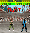
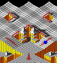
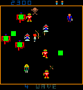
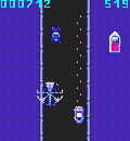
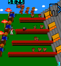
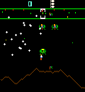
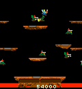
More here: http://imgur.com/a/qTtGs. The titles, in order, are Mortal Kombat, Marble Madness, Robotron, Spy Hunter, Tapper, Defender and Joust.
More here: http://imgur.com/a/qTtGs. The titles, in order, are Mortal Kombat, Marble Madness, Robotron, Spy Hunter, Tapper, Defender and Joust.
Drakker Sat May 06, 2017 11:53 pm
Oh my god! Tapper! So many memories of the good old CGA times.
erico Mon May 08, 2017 4:07 pm
Marble Madness, Tapper, Joust and Defender are games very deep into my ´game´ life.
I experienced most of them by conversions to the tandy color computer, they sit greatly at the center of my heart. :)
I experienced most of them by conversions to the tandy color computer, they sit greatly at the center of my heart. :)
erico Tue May 09, 2017 2:34 pm
While a bit off topic, I think this subject might be an interesting read to the artists here and the code artists looking at visual techniques to produce extra colors. Page needs java for its cool examples.
http://www.aaronbell.com/secret-colours ... modore-64/
http://www.aaronbell.com/secret-colours ... modore-64/
Drakker Sat May 13, 2017 1:15 am
Alright, let's suppose I'm going forward with the not-Kirby game. Say, instead of breathing monsters in, something a little more dramatic is done. Say, the little guy is called "little devil" or "lil' monster" or something.
What do you guys think?
- lilmonsteranimated_big.gif (2.01 KiB) Viewed 3790 times
- lilmonsteranimated.gif (621 Bytes) Viewed 3790 times
What do you guys think?
erico Sat May 13, 2017 2:42 am
Extremely great and fluid animation! Maybe we should start posting animated mocks! :)
adekto Sat May 13, 2017 10:16 am
misread the file name as "lemon star animated_big.gif"
looks cool, i see your going cross platform with this one XD
looks cool, i see your going cross platform with this one XD
rodot Mon May 15, 2017 8:48 am
Thank you all for the great mockups and thinking, it's helping a lot !
About the dark tones : the problem with non-IPS LCD display is that dark tones shift quickly when you look at the screen at an angle. Plus the gamma curves makes the dark tones look darker than on a PC screen. If I used darker dark tones, it's pretty difficult to see the difference with black, especially when you're not perfectly in front of the screen. You guys might see it by yourself this summer, beta version on the way ;)
About the dark tones : the problem with non-IPS LCD display is that dark tones shift quickly when you look at the screen at an angle. Plus the gamma curves makes the dark tones look darker than on a PC screen. If I used darker dark tones, it's pretty difficult to see the difference with black, especially when you're not perfectly in front of the screen. You guys might see it by yourself this summer, beta version on the way ;)
erico Mon May 15, 2017 3:01 pm
I know what you mean, I have a running atari linx here and the comparison between my computer´s monitor (emulator) to the atari´s real screen is exactly as you say. The effect is quite strong. I think that was one of the reasons games on the linx were so brightly colorful. It also happens with my Caanoo, but on a lower degree.
What? This summer? Brazilian summer?? It just about ended so I believe you mean anytime now? :D
What? This summer? Brazilian summer?? It just about ended so I believe you mean anytime now? :D
adekto Tue May 16, 2017 2:19 pm
Nice try but I think he means European summer
Wich idk isn't it just starting, its so hot outside already
I do wonder about the display i mean the panel i got the color shifts are less noticeable in portrait since there originally meant for some flip phone
Wich idk isn't it just starting, its so hot outside already
I do wonder about the display i mean the panel i got the color shifts are less noticeable in portrait since there originally meant for some flip phone
erico Wed May 17, 2017 1:15 am
Yep I´m also interested in knowing more about the display.
I will check some mocks on the caanoo screen just in case while waiting but I still think some tones are way too similar to be useful and we have too many brown variants. I´m finishing a mock about PRESSURE SOLDER and I´m having way more trouble getting the colors going than anything else graphic wise. If we get to know the display, maybe we could create a color profile to render the colors on graphic applications more akin to the final result visible on the real screen.
I will check some mocks on the caanoo screen just in case while waiting but I still think some tones are way too similar to be useful and we have too many brown variants. I´m finishing a mock about PRESSURE SOLDER and I´m having way more trouble getting the colors going than anything else graphic wise. If we get to know the display, maybe we could create a color profile to render the colors on graphic applications more akin to the final result visible on the real screen.
erico Wed May 17, 2017 1:54 am
Here is a work in progress.
The game mock is based on Pressure Cooker for the Atari 2600 ( https://youtu.be/XPFGhjIrXDc ).
---chessy synopsis
PRESSURE SOLDER
Rodot, the master solder, has a lot of Gamebuinos to deliver.
Since the pick and place machine can´t populate as fast as he can, he set it so to skip some components that he will be soldering on the fly.
That is the most optimum way to make the delivery!
Are you up to the challenge?
---end of cheese
The game mock is based on Pressure Cooker for the Atari 2600 ( https://youtu.be/XPFGhjIrXDc ).
---chessy synopsis
PRESSURE SOLDER
Rodot, the master solder, has a lot of Gamebuinos to deliver.
Since the pick and place machine can´t populate as fast as he can, he set it so to skip some components that he will be soldering on the fly.
That is the most optimum way to make the delivery!
Are you up to the challenge?
---end of cheese
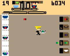
- PRESSURE SOLDER.png (21.38 KiB) Viewed 4153 times
adekto Wed May 17, 2017 11:28 am
lol, i like the idea, not sure how your going to licence Rodot's likeness XD
erico Wed May 17, 2017 1:38 pm
If he does not give away the license...We just call it Guile then. :lol:
The current mock needs a lot of work but I´m happy with the layout.
The machine on the top looks way better when animated, when still like it is , it is quite a mess.
A bit more description...the gamebuinos on the running machine are already visible on what it lacks, so you get the part to finish it from the right machines, which are, from top to down, battery, controls,speaker,screen. The last one is the case.
I have also added other elements, not visible on the mock, on the playfield to extend playability.
The original game, while fun and quite unique, can get boring after a while...but not this one! :)
The current mock needs a lot of work but I´m happy with the layout.
The machine on the top looks way better when animated, when still like it is , it is quite a mess.
A bit more description...the gamebuinos on the running machine are already visible on what it lacks, so you get the part to finish it from the right machines, which are, from top to down, battery, controls,speaker,screen. The last one is the case.
I have also added other elements, not visible on the mock, on the playfield to extend playability.
The original game, while fun and quite unique, can get boring after a while...but not this one! :)
adekto Wed May 17, 2017 3:56 pm
wow cool, cant wait to play that ;)
erico Fri May 26, 2017 11:56 pm
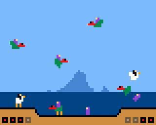
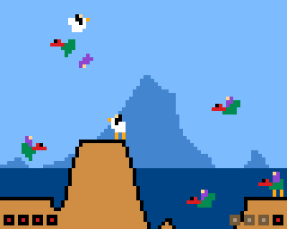
heck, I just wish I could make some time and money to code some of the ideas, but never the less, here is a Pegasus and the Phantom Riders with Buzzard Bait (Joust) ostrich/chicken style. :D
As said before, it is quite a challenge to fit into the final resolution, hence I decided to use the chickens as they scale better and Pegasus style stages as they don´t have too many platforms. We could add pass through platforms too.
Now I´m sure we have too many browns, 6, ( (c64 anyone?) and not enough blues, 3. The later could have one or two extra tones to help background creation...aerial perspective and stuff, the former could loose a couple tones. But that is just loud thinking, I haven´t come up with any actual solution.
As said before, it is quite a challenge to fit into the final resolution, hence I decided to use the chickens as they scale better and Pegasus style stages as they don´t have too many platforms. We could add pass through platforms too.
Now I´m sure we have too many browns, 6, ( (c64 anyone?) and not enough blues, 3. The later could have one or two extra tones to help background creation...aerial perspective and stuff, the former could loose a couple tones. But that is just loud thinking, I haven´t come up with any actual solution.
- BUZZARD LV01.png (20.64 KiB) Viewed 4097 times
- BUZZARD LV02.png (20.82 KiB) Viewed 4097 times
Drakker Sat May 27, 2017 1:17 am
Looks great erico!
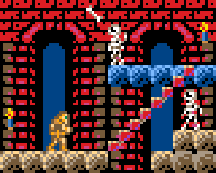
I played some more with the palette, and with careful color choices, using bright colors as background isn't all that bad...
I played some more with the palette, and with careful color choices, using bright colors as background isn't all that bad...

- castle_dude_v2.png (2.17 KiB) Viewed 4095 times
- castle_dude_v2-big.png (3.15 KiB) Viewed 4095 times
erico Sat May 27, 2017 3:08 am
It isn´t, looks all fine and set, but it is quite aggressive and if the background is bright, you foreground either needs black silhouette, darker colors or some kind of outline. My idea, when low res as our display is, is to make a difference by tone, not by outlines or contrast. Would that work on the final display? We would have to see.
Really nice updated mockup. Way more lively then before but would that purple show anything against the red on the new display?
Really nice updated mockup. Way more lively then before but would that purple show anything against the red on the new display?
adekto Sat May 27, 2017 10:39 am
i agree that outlines just end up waisting precious pixels, though that castlevania looks amazing, and it will probably fine if you consider movement
adekto Sat May 27, 2017 11:13 am

- hauntedhouse.png (15.13 KiB) Viewed 4083 times
a little more on the simplistic side but atari 2600 games seem to work well
Drakker Sat May 27, 2017 11:14 am
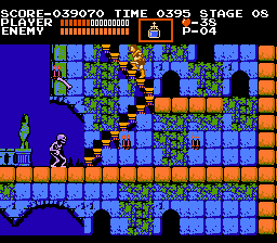
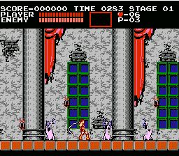
Well, it will all be in the contrast. Everything that moves will have to use the brightest colors, and things the player is expected to collide with will also have to use the brightest colors. It seems that it will just be a mental shift, really, look at old NES screen shots, they have bright backgrounds, but the things the player collides with are also using contrasting colors.
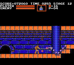
erico Sat May 27, 2017 3:18 pm
True, also, the movement itself would help split the objects.
Nice one adekto! I like the light through the windows.
Played a lot of that ages ago.
Nice one adekto! I like the light through the windows.
Played a lot of that ages ago.
Drakker Sat May 27, 2017 7:03 pm
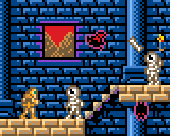
This is really working pretty well... even on my super bright display. This is quite promising actually.
- castle_dude_2_v1.png (2.29 KiB) Viewed 4445 times
- castle_dude_2_v1-big.png (3.29 KiB) Viewed 4445 times
adekto Sat May 27, 2017 9:24 pm
wow thats looking super, i kinda wanna play that now XD
adekto Sat May 27, 2017 9:54 pm

- belmondwalkx2.gif (1.67 KiB) Viewed 4443 times
:? not sure if im doing this right but i used the originals as reference
Drakker Sun May 28, 2017 5:10 pm
Nice! But there is something weird with the hand it seems to stay in place over two frames...
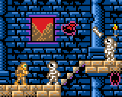
I've looked a lot at NES / Sega / Game gear games in the last few days and I realized something... hardly any game ever uses yellow. It's almost always substituted for beige. It could be worth it to replace yellow with another color depending on the game context. For the Castlevania style dark games, changing yellow for a dark purplish red would be better, and for something bright like Kirby, changing yellow for bright pink would be great.
Edit: tweaked the last mockup a bit, the castle looked way too new.
I've looked a lot at NES / Sega / Game gear games in the last few days and I realized something... hardly any game ever uses yellow. It's almost always substituted for beige. It could be worth it to replace yellow with another color depending on the game context. For the Castlevania style dark games, changing yellow for a dark purplish red would be better, and for something bright like Kirby, changing yellow for bright pink would be great.
Edit: tweaked the last mockup a bit, the castle looked way too new.

- castle_dude_2_v2.png (2.7 KiB) Viewed 4429 times
- castle_dude_2_v2-big.png (3.74 KiB) Viewed 4429 times
adekto Mon May 29, 2017 11:43 am
well from what i have used with these types of lcd modules the yellow is always more of an orange i assume it has to do with the 565 rgb bit packing
Drakker Tue May 30, 2017 1:41 am
The 565 thing doesn't prevent display of a pure yellow, it just means that there are more steps in the green ladder than in the red and blue. Not using yellow seems to have been a deliberate choice...
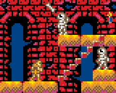
I gave the old treatment to the first scene. This is getting closer to what a finished product should look like.
I gave the old treatment to the first scene. This is getting closer to what a finished product should look like.

- castle_dude_v3.png (2.46 KiB) Viewed 4403 times
- castle_dude_v3-big.png (3.73 KiB) Viewed 4403 times
erico Sat Jun 03, 2017 4:02 pm
I have been coding a slightly higher resolution of this game...quickly made a Gamebuino 2 mockup.
Which game is this? Beware it is age telling. :D
edit: forgot the ladders...
Which game is this? Beware it is age telling. :D
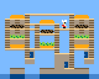
- BT.png (19.7 KiB) Viewed 4342 times
edit: forgot the ladders...
Myndale Sat Jun 03, 2017 11:12 pm
Lol, spotted it immediately, sad to say. :D
You really know how to make each and every one of those pixels count!
You really know how to make each and every one of those pixels count!
Drakker Sun Jun 04, 2017 12:13 am
Catchy song too!
erico Sun Jun 04, 2017 12:43 am
2 voices into that jazz! Hopefully we will be able to use 3 or 4 on our hardware. :D
I experienced this game on an intellivision when I was an egg, later on the coco II...never saw the real arcade. :(
edit: I´m quite found of Data East. :)
I experienced this game on an intellivision when I was an egg, later on the coco II...never saw the real arcade. :(
edit: I´m quite found of Data East. :)
Drakker Sun Jun 04, 2017 6:23 pm
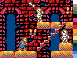
Still toying with those mockups. I'm thinking of changing the palette every level and have 3 colors that can be swapped to whatever seems the most useful for that level. I swapped yellow, purple and light green for a mid-tone gray, darker red and darker blue. Both greens were combined into a mid-tone green that would work for eventual vegetation. Also, the hero is now wearing a blue overcoat.
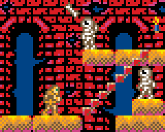
With the old version for reference.

- castle_dude_4_v1.png (3.62 KiB) Viewed 6035 times
- castle_dude_4_v1-big.png (4.97 KiB) Viewed 6035 times
- castle_dude_v3-big.png (3.73 KiB) Viewed 6041 times
With the old version for reference.
Drakker Tue Jun 06, 2017 12:47 am
I'm still not done trying to assimilate this thread into my own evolving mockups thread... =)
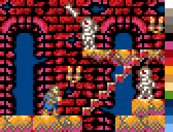
Alright, finishing touch, making the blocks look old and damaged. I think this is pretty much done by now, this tile set is complete.
And here's a picture that shows all the steps in the tile set's evolution.
Alright, finishing touch, making the blocks look old and damaged. I think this is pretty much done by now, this tile set is complete.

- castle_dude_5_v1.png (1.47 KiB) Viewed 6018 times
- castle_dude_5_v1-big.png (2.3 KiB) Viewed 6018 times
And here's a picture that shows all the steps in the tile set's evolution.
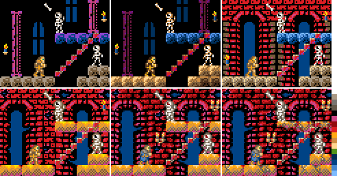
- castle_dude_evolution.png (15.25 KiB) Viewed 6017 times
adekto Fri Jun 09, 2017 11:12 am
interesting how it has progressed
but the more detail the background makes it harder to see the foreground characters, i think you might need to go with some kind of black or white outline
but the more detail the background makes it harder to see the foreground characters, i think you might need to go with some kind of black or white outline
Drakker Fri Jun 09, 2017 1:20 pm
Yeah, I'm kind of thinking that too, but I'll wait until I see how it looks on actual hardware before tweaking the palette. That and sprites movement might help too.
Sutchig Tue Jun 13, 2017 1:17 pm
First try with Digger:
edit:
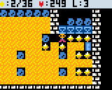
- Digger.png (3.03 KiB) Viewed 5946 times
edit:
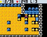
- Digger2.png (2.99 KiB) Viewed 5937 times
adekto Sat Jun 17, 2017 10:16 pm
sprite set of small playing cards for card games like solitaire or poker
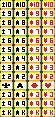
- card.png (16.89 KiB) Viewed 5919 times
Drakker Sun Jul 02, 2017 8:48 pm
I'll let you guess what this one is. It uses a custom palette as all the brown and tan shades are useless for this game.
Edit: could not leave it alone... replaced the boring bonus bar with an oil lamp that will get brighter and brighter the closer you get to the next bonus wildcard gem.

- bejeweled_mockup_3.png (2.63 KiB) Viewed 5821 times
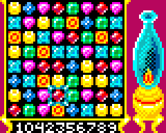
- bejeweled_mockup_big_3.png (4.08 KiB) Viewed 5821 times
Edit: could not leave it alone... replaced the boring bonus bar with an oil lamp that will get brighter and brighter the closer you get to the next bonus wildcard gem.
Drakker Thu Aug 03, 2017 12:55 am
This thread is getting forgotten... can't let this happen! I present to you, Doppler the Porcupine!

- doppler_the_porcupine.png (2.43 KiB) Viewed 5754 times
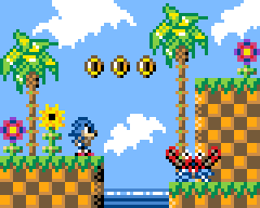
- doppler_the_porcupine_big.png (3.45 KiB) Viewed 5754 times
adekto Sun Aug 06, 2017 11:19 pm
lol looks cool! man are we making one of these?
erico Mon Aug 07, 2017 4:03 am
We definitely should! :)
Sorunome Mon Aug 07, 2017 11:34 am
Drakker wrote:Doppler the Porcupine!
I laughed! :D
Anyhow, looking great ^.^
Drakker Mon Aug 07, 2017 11:53 am
Thanks all! Yeah making one of these is definitely on the table. Given enough time maybe even all of them.
Drakker Mon Aug 07, 2017 8:37 pm
Draft tileset if Doppler the Porcupine is ever a game:
- doppler_the_porcupine_4.png (8.81 KiB) Viewed 6228 times
- doppler_the_porcupine_4_big.png (10.82 KiB) Viewed 6228 times
erico Tue Aug 08, 2017 1:29 am
Incredibly rich, specially the background, which seems not many mocks do sport them.
Drakker Wed Aug 09, 2017 4:47 pm
Thanks for the praise erico!
Still toying with this... the tileset keeps getting bigger and bigger. I think its safe to assume I will go forward with this game now. Special request from my son anyway, he loves Sonic. =)
Still toying with this... the tileset keeps getting bigger and bigger. I think its safe to assume I will go forward with this game now. Special request from my son anyway, he loves Sonic. =)
- doppler_the_porcupine_8.png (8.46 KiB) Viewed 6212 times
STUDIOCRAFTapps Tue Aug 22, 2017 4:18 pm
Drakker wrote:Thanks for the praise erico!
Still toying with this... the tileset keeps getting bigger and bigger. I think its safe to assume I will go forward with this game now. Special request from my son anyway, he loves Sonic. =)
This look like a big project! What if gamebuino had an engin... Wait! I could make an engin!
wuuff Sun Aug 27, 2017 4:31 am
Those "doppler the porcupine" mockups are pretty great. It makes me wonder if they could be de-made for the original gamebuino screen.
I was thinking about how the Gamebuino has a Mario clone but no Sonic clone. Only one half of an epic rivalry! Jokes aside, I'm curious whether a fast-paced game like that would even work on the original Gamebuino display since it's relatively blurry for fast animations. Think it could be made to work?
I was thinking about how the Gamebuino has a Mario clone but no Sonic clone. Only one half of an epic rivalry! Jokes aside, I'm curious whether a fast-paced game like that would even work on the original Gamebuino display since it's relatively blurry for fast animations. Think it could be made to work?
Drakker Mon Aug 28, 2017 1:30 am
The original Gamebuino is way too blurry for such high speed games unfortunately. If you absolutely want to make a Sonic game for the original Gamebuino, I'd do Sonic spinball. The gameplay is generally a lot slower, but its still a really fun game.
About a platformer engine, I'm already working on something (that can hopefully be ported easily to the new Gamebuino when it it released) with the help of a very skilled fellow Gamebuinian, but the more engines we have the better, so I'd say definitely go ahead with the project. I'm looking forward to see what you will be coming up with.
About a platformer engine, I'm already working on something (that can hopefully be ported easily to the new Gamebuino when it it released) with the help of a very skilled fellow Gamebuinian, but the more engines we have the better, so I'd say definitely go ahead with the project. I'm looking forward to see what you will be coming up with.
Drakker Mon Sep 11, 2017 9:46 pm
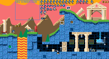
Doppler world 2. The background is a placeholder...
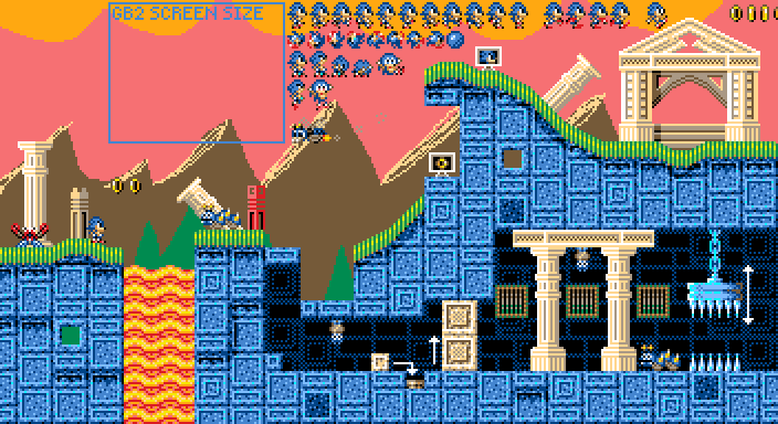
- doppler_world_2_08-gbb-big.png (27.43 KiB) Viewed 10466 times
- doppler_world_2_08-gbb.png (20.46 KiB) Viewed 10466 times
Sorunome Mon Sep 11, 2017 11:09 pm
It's looking great as usual! :D
Drakker Wed Oct 11, 2017 1:24 am
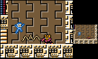
Time for another quick and dirty mock up. First one to guess what this is gets a thumb up.
- megaboy.png (1.61 KiB) Viewed 10389 times
erico Wed Oct 11, 2017 2:35 am
hmmm, it must be Jill of the jungle? :D :D
Some criticism, keep the dark outline on the characters and use something else for darker tones on the BKG.
Wonderful stuff none the less! ;)
Some criticism, keep the dark outline on the characters and use something else for darker tones on the BKG.
Wonderful stuff none the less! ;)
Drakker Wed Oct 11, 2017 12:41 pm
Haha, well, the criticism is right, but I didn't want to spent a lot of time on this, so I used the closest color in the Gamebuino palette and made it look as close to the original NES game as possible. I'll readily admit that that background with black lines is terrible.